
A professional website is not just about adding attractive images and colours. Its overall appearance depends on how different design elements work together, including colour themes, typography, layouts, spacing, images, buttons and navigation.
The right website styling ideas can make a website look modern, premium and trustworthy while helping visitors explore its content comfortably. Whether you are creating a business website, portfolio or ecommerce website, choosing a consistent visual style is important.
In this article, we explore modern website styling ideas, professional colour themes, premium design elements and UI/UX principles that can improve the overall website experience.
Minimalist Website Design for a Clean Appearance
Minimalist design focuses on simplicity. It uses fewer visual elements, clean layouts and sufficient white space to make important content stand out.
Styling ideas:
-
- Use a simple colour palette with two or three main colours.
- Choose clean and readable fonts.
- Keep navigation menus short and organised.
- Use sufficient white space between sections.
- Avoid unnecessary animations, graphics and decorative elements.
Best suited for: Corporate websites, professional services, portfolios and consulting businesses.
Premium Website Design with Elegant Styling
A premium-looking website uses carefully selected colours, typography, imagery and spacing to create a refined visual experience.
Premium design does not necessarily mean using expensive-looking effects everywhere. Consistency and attention to detail matter more.
Premium website styling ideas:
-
- Use deep colours such as navy, charcoal, forest green or burgundy.
-
- Combine dark backgrounds with subtle accent colours.
-
- Choose elegant typography with clear heading styles.
-
- Use high-quality photography and custom graphics.
-
- Add subtle shadows, thin borders and refined button styles.
-
- Use generous spacing to give content room to breathe.
Best suited for: Luxury brands, architecture firms, interior designers, premium consultants and high-end service businesses.
Professional Website Colour Themes
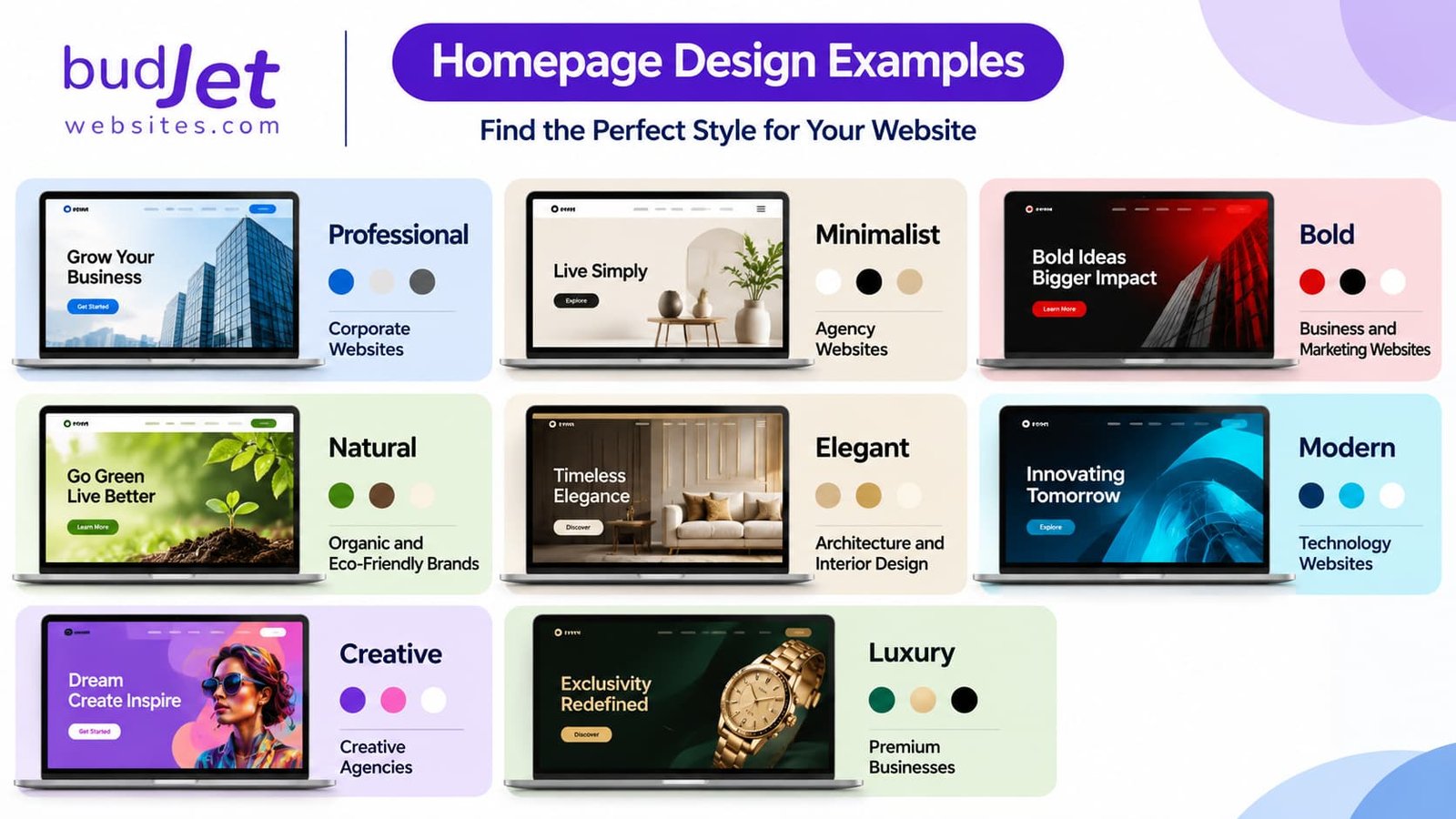
Modern Typography for a Professional Look
Typography affects both the appearance and readability of a website. The right font combinations help create a clear visual hierarchy.
Typography styling ideas:
-
- Use bold, prominent headings to introduce important sections.
-
- Choose simple fonts for paragraphs and longer content.
-
- Combine a display font with a readable body font when appropriate.
-
- Maintain consistent font sizes across similar elements.
-
- Use suitable line spacing to make text easier to read.
-
- Avoid using too many font families on one website.
For example, a modern business website can use a bold sans-serif heading with a clean sans-serif body font. A luxury brand may use an elegant serif heading paired with a simple sans-serif body font.
Creative Website Layouts and Section Styling
The way content is arranged influences how visitors explore a website. A well-planned layout makes information easier to understand.
Website layout ideas:
- Split-screen layout: Place text on one side and an image on the other.
- Card-based layout: Display services, products or features in separate cards.
- Grid layout: Organise images, projects or products into aligned sections.
- Full-width layout: Use large images or background sections to highlight important content.
- Asymmetrical layout: Arrange images and text in an intentionally unbalanced composition for a creative appearance.
- Alternating sections: Switch image and text positions as visitors scroll down the page.
Choose a layout based on the type of content rather than using the same design pattern everywhere.
High-Quality Images and Visual Elements
Images and graphics help communicate what a business offers. Poor-quality or unrelated visuals can make even a well-designed website look unprofessional.
Visual styling ideas:
- Use high-resolution images that are relevant to the business.
- Maintain consistent image proportions across cards and sections.
- Use original project photographs where possible.
- Add simple illustrations or icons to explain services.
- Apply consistent image treatments across the website.
- Optimise images so they do not slow down page loading.
Buttons, Cards and Interactive Elements
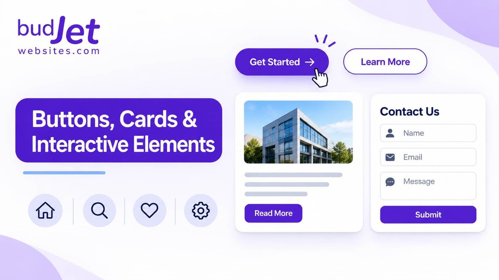
UI styling ideas:
- Use consistent button shapes, sizes and colours.
- Add subtle hover effects to buttons and links.
- Use rounded or square-corner cards consistently.
- Apply light borders or subtle shadows to separate content.
- Keep form fields simple and easy to identify.
- Use recognisable icons alongside clear labels.
Dark and Light Website Themes
UI styling ideas:
- Use consistent button shapes, sizes and colours.
- Add subtle hover effects to buttons and links.
- Use rounded or square-corner cards consistently.
- Apply light borders or subtle shadows to separate content.
- Keep form fields simple and easy to identify.
- Use recognisable icons alongside clear labels.
Dark and Light Website Themes
Light theme ideas:
- White or off-white backgrounds.
- Dark text for clear readability.
- Soft grey section backgrounds.
- Subtle borders and restrained accent colours.
Dark theme ideas:
- Charcoal or deep navy backgrounds.
- Light text with comfortable contrast.
- Bright accent colours for important buttons.
- Subtle borders to separate content sections.
Responsive Website Styling for Mobile and Desktop
A responsive website design ensures that pages adapt to different screen sizes and devices.
Responsive Design Tips:
-
Use flexible layouts and grids.
-
Adjust columns for mobile screens.
-
Keep text readable and buttons easy to tap.
-
Resize images to fit different screens.
-
Test navigation and forms on mobile devices.
Formula:
Responsive Design = Flexible Layout + Scalable Images + Media Queries + Mobile-Friendly Navigation